
Evaluating “AR Sports Basketball”
Client: Independent Case Study Role: Product Designer Product: AR Sports Basketball Duration: 1.5 Weeks


OVERVIEW
Augmented Reality is one of the fastest growing categories in the IOS App Store. New offerings are being added daily and the majority of these apps rate favorably. However, even with high ratings the number of ratings are small, and the popularity of AR apps remains low.
APPROaCH
I decided to conduct an independent UX product design study the gap in retention, choosing AR Sports Basketball because of it’s common subject matter and game play. It should be noted that I am not affiliated with AR Sports Basketball or it’s creators, Triangle factory.
process
I conducted targeted user research based on mobile demographics. Seven players, dispersed in age and gender, were interviewed and tested. All the players initially reacted favorably, but issues occurred during game play:
Players had trouble starting the game and finding correct controls.
Players had difficulty understanding the scoring objectives.
1/7 players said they would play the game again.
RESULTS
By editing the start menus and adding a onboarding tutorials section, I was able to increase player comprehension and retention with few fundamental changes. I concluded although AR does have appeal, it still must be paired with a compete user experience. And when properly integrated, Augmented Reality can enhance game play and encourage re-engagement.


DEMOGRAPHICS
To understand who would comprise my players I first researched game demographics. Surprisingly, young adults make up a smaller share of mobile game players than working professionals. However, because AR is new technology, I included the young adults as early adopters with the larger professional group. The final group was also gender neutral, reflecting the current state of players.

PLayer Testing
I conducted guerrilla research on seven individuals. Because everyone considered themselves active players, I asked several standardized questions about gaming history and preferences. The answers allowed me to populate personas with motivations and goals, and prioritize player testing feedback.
Players identified scoring as a motivation in their gaming history.
Players identified ease of play and quick game times as a motivation.

affinity mapping: SYNTHESIZE & Analysis
Keeping history in mind, I chronicled individual pain points discovered during testing. Each notation was then grouped by subject matter and mapped into categories.

The players had trouble starting the game and finding the correct controls.
The players had difficulty understanding the scoring or objective.
The players were dissatisfied the graphics.
Post game, the players could not identify their high score score or any leader boards.
The players had post game feature requests.

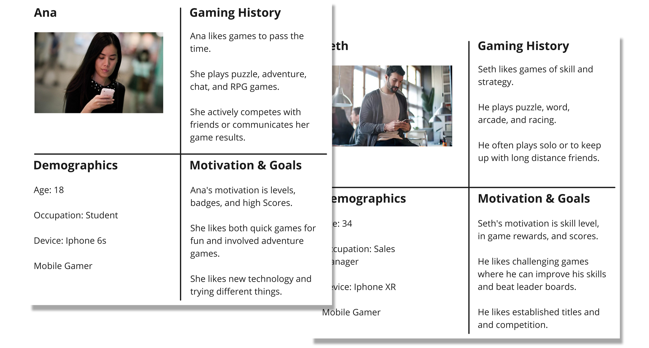
PLAYER PERSONAS
I created two personas which bridged the demographics and helped in the creation of task flows.
TASK FLOWS: mappING EDITS
Player research resulted in a modified flow that would streamline onboarding and improve interactions.
CURRENT TASK FLOW

MODIFIED TASK FLOW

MOCKUPS: LO-FI Sketches
Lo-Fi sketches were used to ideate design solutions. After rough prototyping, the lack of player comprehension could be fixed by addressing two areas:
Menu layout and labels.
Additional tutorial content.

MOCKUPS: HI-FI
Changes were made to the onboarding process both in menu structure in additional content. Style changes were kept to a minimum as I focused on incremental changes on user experience.
Home screen reorganization and labeling
Categorized and more descriptive game modes were added to remedy player confusion at setup. The high score button was moved to the menu area with where a button shadow element was added.

Menu screen options and scale information
Changes to format were made with additional mode labels added for AR setup comprehension.

SCORING cleanup and clarification
To avoid score confusion, layout and labeling changes were made to the top dashboard. It was shown that these minimal changes lead to 6/7 players now understanding the endless play option.

MOCKUPS: HI-FI onboarding tutorial
To solve user comprehension issues I created new tutorials to demonstrate both game setup and play mechanics.


CONCLUSIONS
After prototyping the newly designed menus and additional tutorial sections, there was a measurable increase in player performance and comprehension. Augmented Reality is an exciting addition to game play, but it must be integrated completely with existing user patterns. In the case of AR Sports Basketball, small changes to the onboarding process were enough to integrate the experience and remedy player confusion.
